
Project Overview
Arcane Conquest required a logo that embodies the core elements of magic, strategy, and immersive gameplay. This case study explores the design process, key creative decisions, and the resulting logo that sets the brand apart in the competitive world of fantasy card gaming. The goal was to create a visual identity that resonates with players, reflects the game’s arcane themes, and establishes a strong, recognizable presence.
Design Challenges and Solutions
The Problem:
Card games often struggle to immerse players fully in their worlds due to inconsistent visual design and overly complex interfaces. This disconnect can make it harder for players to engage deeply and enjoy the game as intended.
The Arcane Conquest Solution:
Our approach focused on creating a visually cohesive experience that pulls players into a dark fantasy world. Every design element—from the intricately illustrated cards to the atmospheric user interface—reinforces the game’s theme and narrative. By simplifying the interface, we ensured that players could navigate effortlessly while still feeling connected to the immersive fantasy realm.
Why This Matters:
Consistent, immersive design paired with a user-friendly interface doesn’t just enhance the visual appeal; it creates an emotional connection between the player and the game. Arcane Conquest stands out as a card game that both looks stunning and plays seamlessly, making it easier to attract and retain players.
Design Process
Research and Discovery:
To begin the branding process for Arcane Conquest is conducted thorough research into the fantasy card gaming industry, analyzing competitor logos and game aesthetics. Our goal was to design a logo that captures the essence of magic, strategy, and adventure, while also appealing to players of all skill levels. We explored popular themes in fantasy card games, focusing on what resonates with the target audience, including magical symbols, mythical elements, and strategic gameplay motifs.
Concept Development:
Multiple design concepts were explored for Arcane Conquest, concentrating on symbols and elements that convey power, mystery, and magical conquest. Initial sketches featured mystical runes, enchanted swords, and intricate shields, reflecting the game’s core themes of strategic battles and arcane mastery. Each concept was created to evoke a sense of wonder and adventure, blending magical elements with clean, modern lines.
Design Refinement:
After reviewing initial concepts, the design entered the refinement stage, focusing on the most iconic and resonant elements. Through multiple iterations, the logo was refined to reflect a balance between mystery and clarity, ensuring it remains recognizable and impactful across digital and physical formats. The final design features an abstract, enchanted symbol that represents both the power and strategy essential to the game, integrated with subtle arcane motifs that invite players into the world of Arcane Conquest.

Logo Elements:
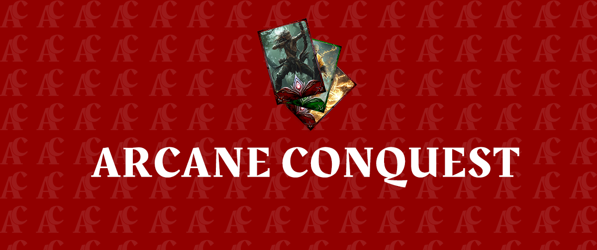
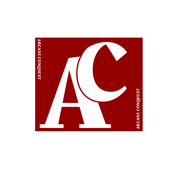
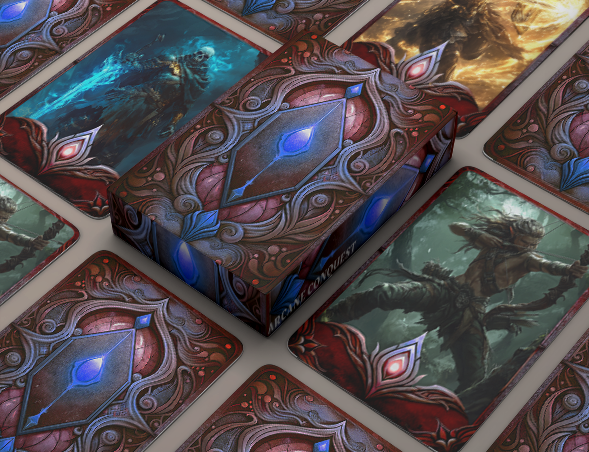
* Card Design Motif: The logo features a stylized image of a playing card, symbolizing the core of the game. The card’s detailed edges and mystical design give it a fantasy-inspired look, hinting at the game’s arcane nature.
* Symbolism: The card incorporates arcane symbols and enchanting elements that represent magical powers and strategic battles.
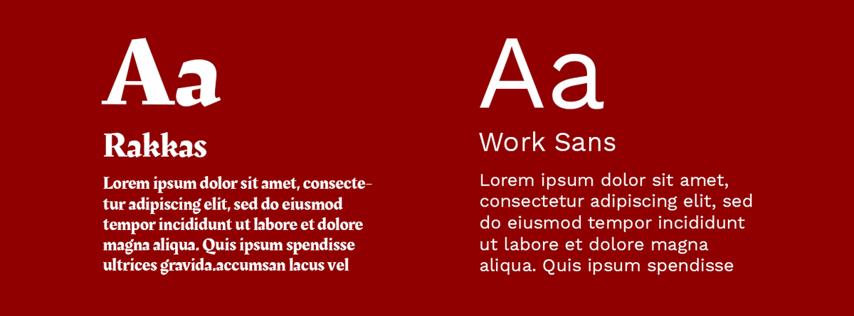
* Typography: The logo combines fantasy with modernity with Rakkas and Work Sans fonts. Rakkas brings an elegant, mystical feel, while Work Sans ensures readability and a contemporary edge, balancing the fantasy setting and accessibility.
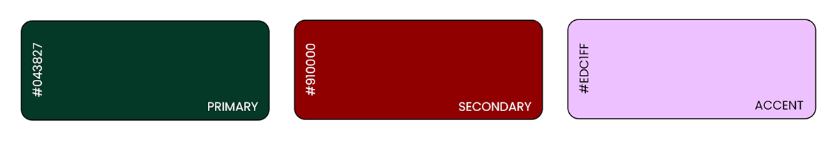
* Color Palette: The dark green and deep red tones are complemented by off-white and yellow accents. These colors give the logo an immersive, magical feel, while also maintaining a sense of tradition and adventure.
The final logo features a clean, mystical design, with a stylized playing card that showcases arcane symbols and magical elements. The bold typography, combining Rakkas for a mystical flair and Work Sans for modern readability, reinforces the brand’s balance of fantasy and accessibility. Perfectly aligning with the enchanting world of Arcane Conquest.
Impact on Branding:
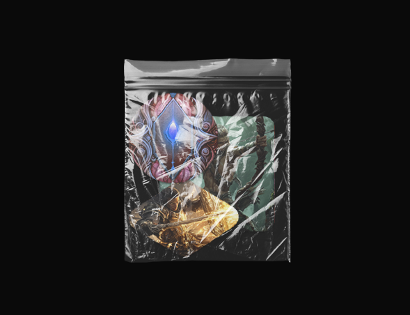
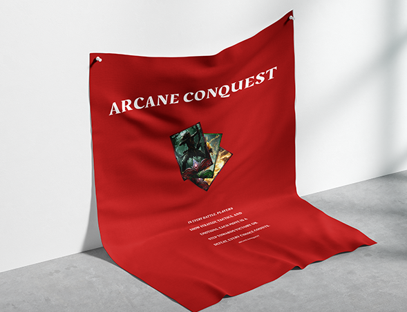
* Visual Identity: he logo serves as the cornerstone of Arcane Conquest’s visual identity. It is prominently displayed on all branding materials, from the website and mobile platform to packaging for the card game decks and merchandise, including stickers and promotional content.
* Brand Recognition: The distinct elements of the logo, such as the mystical card imagery, bold typography, and captivating color palette, make it easily recognizable and memorable. Gamers quickly associate the logo with the strategic depth, fantasy, and immersive experience provided by Arcane Conquest.
* Consistency and Cohesion: The logo ensures consistency across all brand touchpoints. Whether players are exploring the website, purchasing card packs online, or interacting on social media, the cohesive visual identity reinforces Arcane Conquest’s world of magic and adventure.
Summary
The logo for Arcane Conquest successfully captures the essence of fantasy, strategy, and adventure. Through meticulous design and thoughtful refinement, we created a visual identity that stands out in the card gaming industry, fostering excitement and recognition among players. The logo, with its striking imagery and cohesive branding, helps immerse players in the magical world of Arcane Conquest, while reinforcing the game’s identity across both digital and physical platforms.


