
Project Overview
HoneyPlant, a funky music band, required a logo that encapsulates their vibrant energy and artistic expression. This case study explores the design process, key decisions, and the resulting logo that sets the band apart in the music industry.
Branding Challenges and Solutions
The Problem:
In the competitive landscape of the music industry, many bands face the challenge of generic branding that fails to capture their unique sound and personality. Logos that lack originality can hinder a band’s ability to connect with their audience and stand out among countless others.
The HoneyPlant Solution:
The branding for HoneyPlant is designed to reflect the band’s musical style and vibrant personality. We created a distinctive logo that captures their essence and connects emotionally with fans. This cohesive visual identity not only enhances their presence across various platforms but also engages listeners and fosters a sense of community.
Why This Matters:
A standout logo and cohesive branding are vital for a band’s success in the music industry. By developing a memorable identity that connects with fans, HoneyPlant enhances its relationship with its audience, encouraging loyalty and engagement. This strategic approach to branding is essential for flourishing in a competitive music scene.
Design Process
Research and Discovery:
To begin the conducted comprehensive research into the music industry, focusing on the visual elements of popular and iconic bands. Our goal was to create a logo that stands out while embodying the essence of HoneyPlant’s funky and energetic style.
Concept Development:
To explored multiple design concepts, focusing on elements that convey vibrancy, playfulness, and musicality. Initial sketches included abstract representations of music notes, stylized instruments, and vibrant, organic shapes.
Design Refinement:
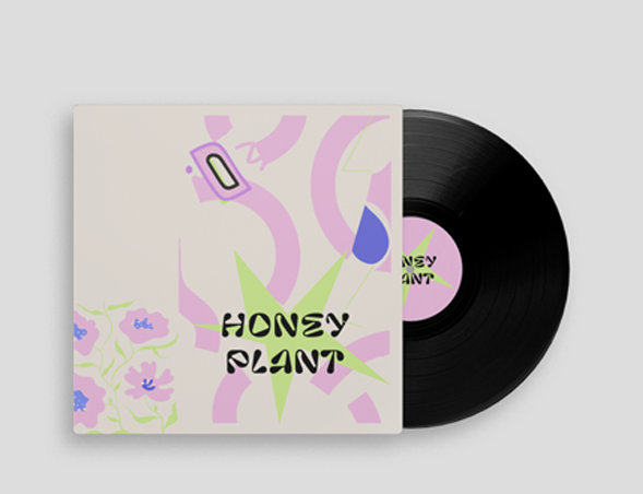
Through iterative design sessions and client feedback, we refined the selected concepts, honing in on a balance between artistic flair and musical elements. The chosen design incorporated a stylized plant with musical notes, symbolizing the band’s funky and natural energy.

Logo Elements:
* Stylized Plant: Represents the band’s organic and natural energy.
* Musical Notes: Symbolizes the band’s musical roots and funky style.
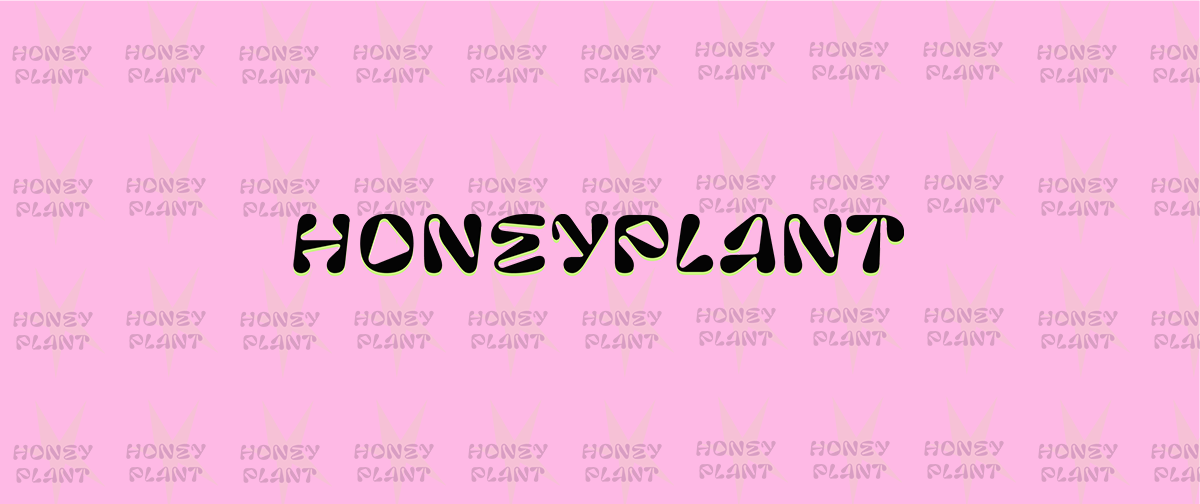
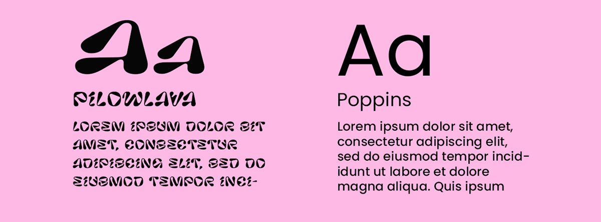
* Typography: Funky and playful fonts that convey energy and artistic expression.
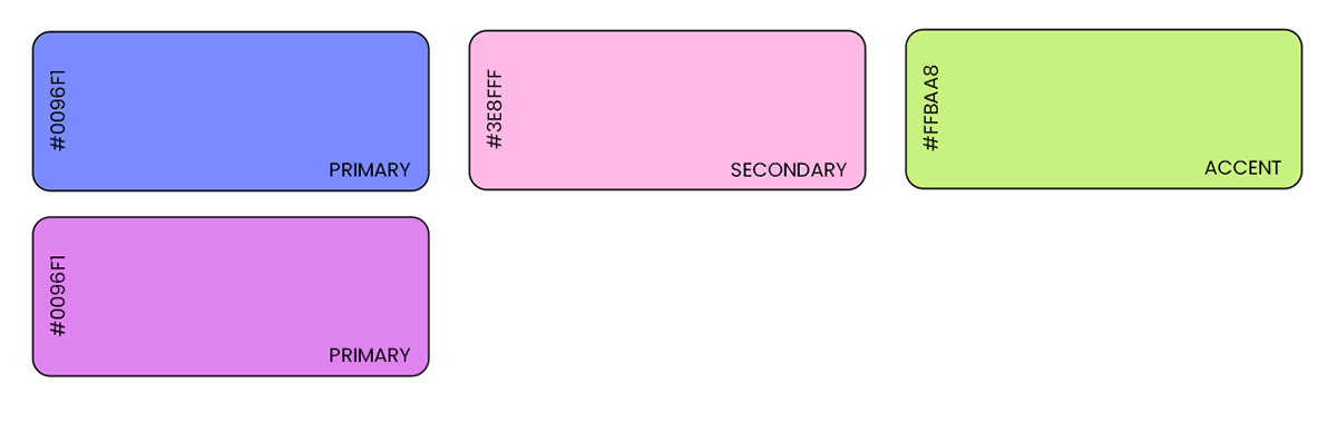
* Color Palette: Bold shades of purple, pink, and lime green to create a visual explosion that mirrors the band’s performances.
The final logo features a vibrant, modern design with a stylized plant intertwined with musical notes. The funky, playful typography reinforces the band’s energetic nature, while the bold color palette evokes a sense of excitement and creativity.

Impact on Branding:
* Visual Identity: The logo is the cornerstone of HoneyPlant’s visual identity. It is prominently displayed on all branding materials, from tour posters and merchandise to digital platforms and social media.
* Brand Recognition: The distinct elements of the logo make it easily recognizable and memorable. Fans quickly associate the logo with HoneyPlant’s electrifying performances and funky style.
* Consistency and Cohesion: The logo design ensures consistency across all brand touchpoints. Whether a fan is attending a concert, browsing the band’s website, or engaging on social media, the cohesive visual identity reinforces HoneyPlant’s energetic and artistic values.

Summary
The logo for HoneyPlant successfully captures the band’s vibrant energy and artistic expression. Through meticulous design and thoughtful refinement, we created a visual identity that stands out in the music industry, fostering recognition and excitement among fans.
“Working with Mikey/Mcxddesign was a fantastic experience. The logo perfectly embodies our band’s vibe and has received wonderful feedback from our fans. It truly sets us apart and makes us proud to showcase our brand.”
– Rob, Member of HoneyPlant.


