

Project Overview
Toy Hive required a logo that encapsulates their core values of boldness, friendliness, and excitement. This case study explores the design process, key decisions, and the resulting logo that sets the brand apart in the toy shop industry.
Branding Challenges and Solutions
The Problem:
In the toy industry, many stores face the challenge of generic branding that fails to inspire excitement or wonder in children and their parents. Logos often lack the creativity and vibrancy necessary to stand out in a crowded market, making it difficult for brands to forge a connection with their audience.
The Toy Hive Solution:
The branding for Toy Hive is designed to evoke joy and imagination. We developed a whimsical, colorful logo that captures the playful spirit of the toy collection, making it instantly appealing to both children and adults. This cohesive visual identity not only stands out on the shelves but also creates a sense of excitement that invites customers to explore the collection.
Why This Matters:
A captivating logo and cohesive branding are essential for engaging customers in the toy market. By creating a memorable identity that resonates with families, Toy Hive establishes itself as a go-to destination for imaginative play. This strategic approach to branding enhances customer engagement and fosters loyalty, helping Toy Hive thrive in a competitive landscape.
Design Process
Research and Discovery:
To began with comprehensive research into the toy shop industry, examining competitors’ logos and identifying key elements that resonate with both children and parents. Our goal was to create a logo that stands out while embodying the essence of Toy Hive.
Concept Development:
The explored multiple design concepts, focusing on elements that convey playfulness, friendliness, and excitement. Initial sketches included playful shapes, vibrant colors, and abstract representations of toys and hives.
Design Refinement:
Through iterative design sessions and client feedback, we refined the selected concepts, honing in on a balance between playful and professional elements. The chosen design incorporated a stylized hive with playful elements, symbolizing both excitement and discovery.

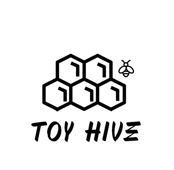
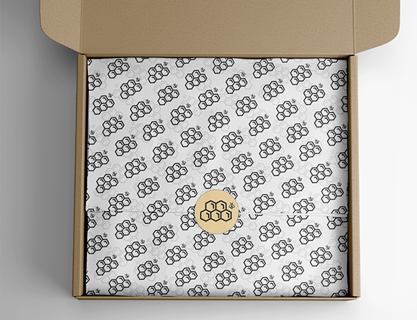
Logo Elements:
* Hive Shape: Represents the idea of a ‘hive’ where toys are abundant and exploration is encouraged.
* Playful Elements: Incorporates shapes and lines that evoke fun and excitement.
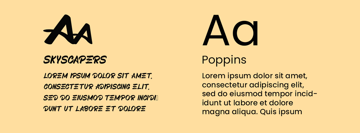
* Typography: Bold and friendly fonts that capture attention and maintain readability.
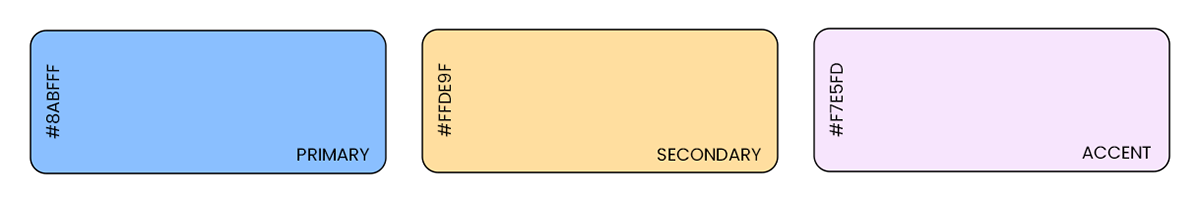
* Color Palette: Light yellow, light pink, and light blue for joy and excitement, complemented by an off-gray background for visual appeal and balance.
The final logo features a clean, modern design with a stylized hive and playful elements. The bold, friendly typography reinforces the brand’s inviting nature, while the harmonious color palette evokes a sense of joy and excitement.
Impact on Branding:
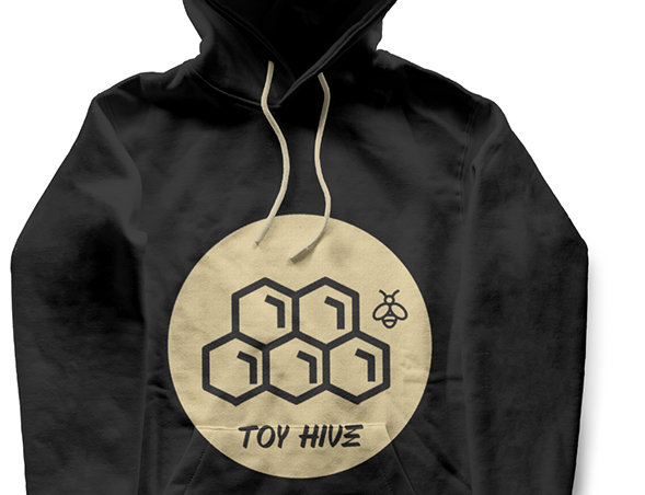
* Visual Identity: The logo is the cornerstone of Toy Hive’s visual identity. It is prominently displayed on all branding materials, from the website and mobile platform to business cards and store signage.
* Brand Recognition: The distinct elements of the logo make it easily recognizable and memorable. Customers quickly associate the logo with the fun, professional, and exciting experience provided by Toy Hive.
* Consistency and Cohesion: The logo design ensures consistency across all brand touchpoints. Whether a customer is visiting the store, exploring the website, or engaging on social media, the cohesive visual identity reinforces the brand’s values and promises.
Summary:
The logo for Toy Hive successfully captures the essence of boldness, friendliness, and excitement. Through meticulous design and thoughtful refinement, we created a visual identity that stands out in the toy shop industry, fostering recognition and excitement among customers.


