
Project Overview
SwiftSmile Orthodontics required a logo that encapsulates their core values of trust, professionalism, and warmth. This case study explores the design process, key decisions, and the resulting logo that sets the brand apart in the orthodontics industry.
Branding Challenges and Solutions
The Problem:
In the competitive landscape of orthodontics, many practices struggle with generic branding that fails to convey trust and professionalism. Uninspired logos can create an impression of mediocrity, making it difficult for potential patients to choose their practice over others.
The SwiftSmile Solution:
The branding for SwiftSmile Orthodontics is designed to evoke feelings of trust and comfort. We developed a modern and friendly logo that reflects the practice’s commitment to patient care and innovative treatment options. This cohesive visual identity not only enhances brand recognition but also instills confidence in patients seeking orthodontic services.
Why This Matters:
An effective logo and cohesive branding are critical for success in the healthcare sector. By establishing a memorable identity that resonates with patients and their families, SwiftSmile Orthodontics fosters loyalty and drives referrals. This strategic branding approach is crucial for thriving in a competitive healthcare landscape.
Design Process
Research and Discovery:
To begin the conducted comprehensive research into the orthodontics industry, examining competitors’ logos and identifying key elements that resonate with patients. Our goal was to create a logo that stands out while embodying the essence of SwiftSmile Orthodontics.
Concept Development:
The explored multiple design concepts focus on elements that convey trust, reliability, and approachability. Initial sketches included clean, modern designs featuring abstract dental imagery and stylized elements that evoke a sense of care.
Design Refinement:
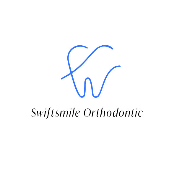
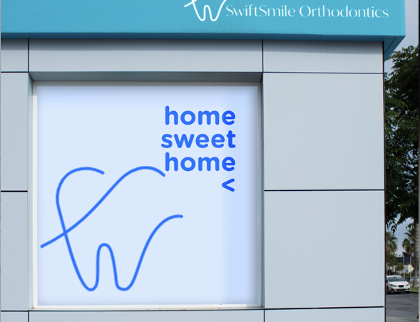
Through iterative design sessions and client feedback, we refined the selected concepts, honing in on a balance between professional and welcoming elements. The chosen design incorporated a stylized tooth integrated with a smile, symbolizing both expertise and friendliness.

Logo Elements:
* Stylized Tooth: Represents dental care and the focus on orthodontics.
* Smile: Symbolizes friendliness and a welcoming environment.
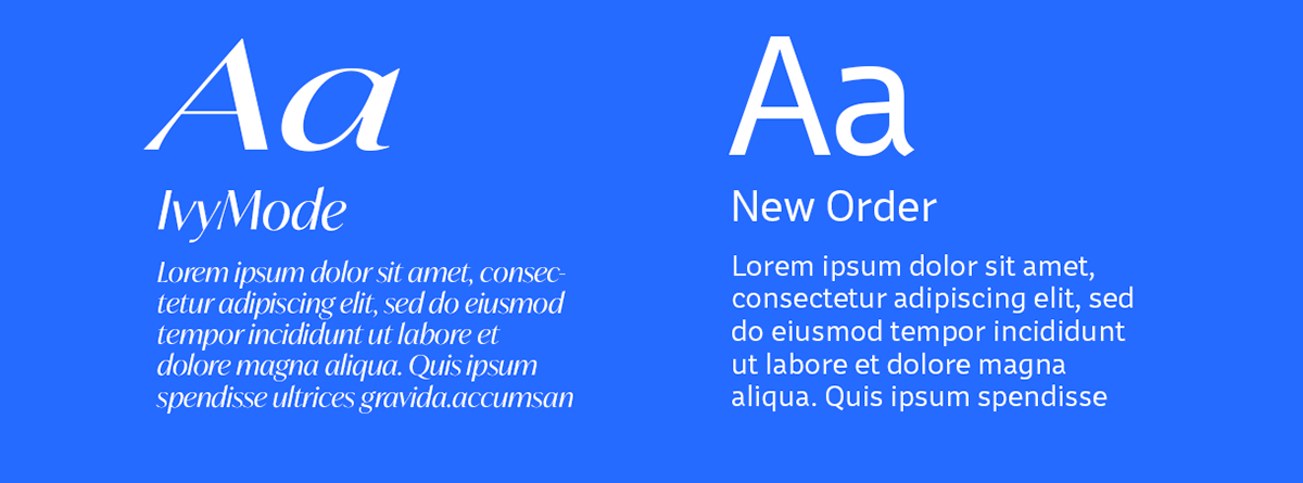
* Typography: Bold yet approachable fonts that convey professionalism and trust.
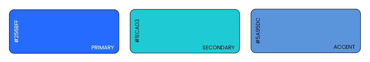
* Color Palette: Vibrant blue for trust and tranquility, complemented by shades of white for cleanliness and clarity.
The final logo features a clean, modern design with a stylized tooth and smile. The bold, friendly typography reinforces the brand’s approachable nature, while the harmonious color palette evokes a sense of calm and trust.
Impact on Branding:
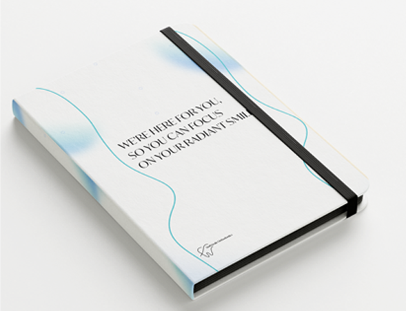
* Visual Identity: The logo is the cornerstone of SwiftSmile Orthodontics’ visual identity. It is prominently displayed on all branding materials, from the website and mobile platform to business cards and office signage.
* Brand Recognition: The distinct elements of the logo make it easily recognizable and memorable. Patients quickly associate the logo with the positive, professional, and caring experience provided by SwiftSmile Orthodontics.
* Consistency and Cohesion: The logo design ensures consistency across all brand touchpoints. Whether a patient is visiting the clinic, exploring the website, or engaging on social media, the cohesive visual identity reinforces the brand’s values and promises.
Summary:
The logo for SwiftSmile Orthodontics successfully captures the essence of trust, professionalism, and warmth. Through meticulous design and thoughtful refinement, we created a visual identity that stands out in the orthodontics industry, fostering trust and recognition among patients.


